

Revolution Evolution: From There To Here
Revolution Evolution: From There To Here
Gridrunner Revolution is a game that’s been through a lot before it has even been released – two changes of platform, several changes of graphical style, changes of control method and even of the entire main design of the game and focus of the gameplay. Along the way I took pictures and screenshots as we went along, and I thought people might be interested in seeing some of these pictures to see how things have changed.
The starting point was Gridrunner++.
Here it is running on the PC. Gridrunner++ is a somewhat curious beast, being built in a framework originally intended to allow you to test PocketPC applications on the PC. Effectively the game runs on top of a simulation of the PocketPC API. There’s absolutely no use of shaders or any part of the PC’s graphics hardware by the Gridrunner++ code. It works on an internal bitmap and the code manipulates the raw pixels of this bitmap directly to generate sprites, tiles, text, particle systems, everything. This made the code very easy to make work on both the PPC and the PC, but it made absolutely no use of modern graphics hardware.
The first step of the game’s evolution was simply to get it working on the Xbox 360. This involved removing all the pixel-by-pixel direct manipulation of the destination bitmap, replacing the sprite and tile stuff with quad-based equivalents and the particle explosion stuff with pointsprite equivalents, changing the aspect ratio of the game from vertically oriented to horizontally oriented, moving the controls from mouse to joypad, and putting it all inside the Neon engine.
This only took a few days and the earliest screenshot I have of it running in its new home is here:
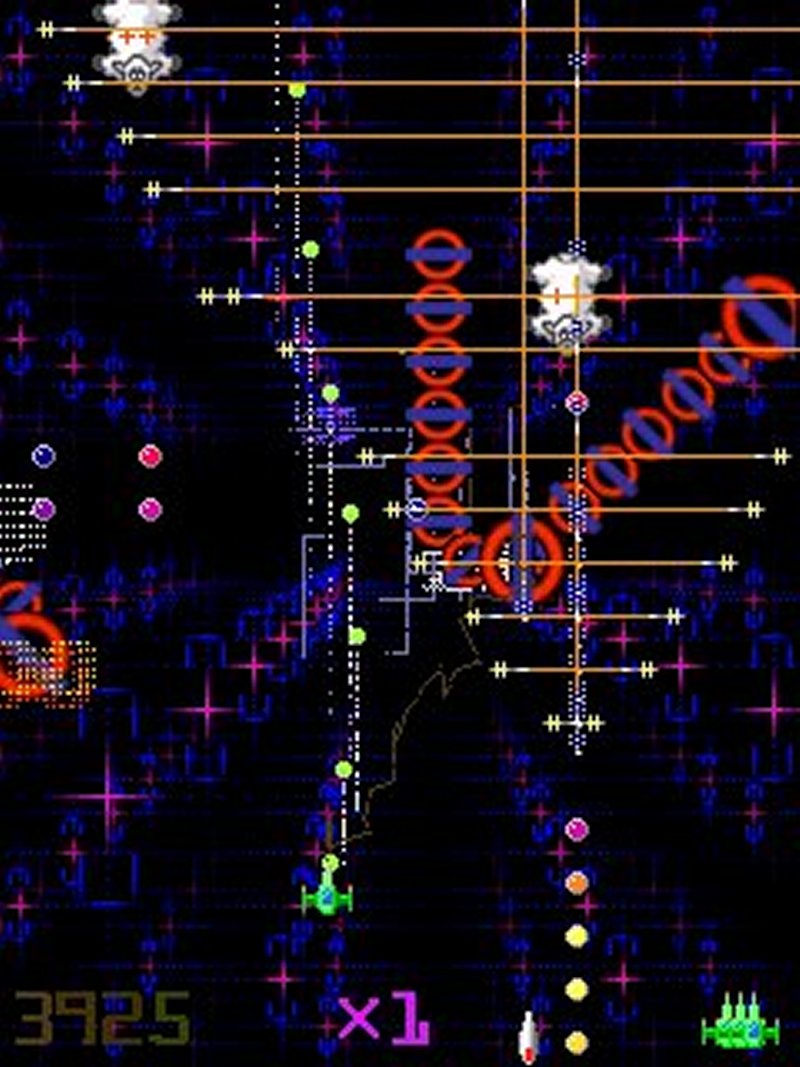
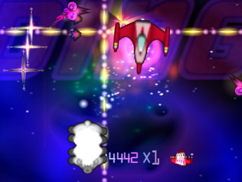
You’ll see it’s running on top of one of the tunnels out of Space Giraffe and using pretty much the identical bitmaps from the older PC game. A couple of new things are already in – the large enumeration of the BM level and the infamous Xbox 360 Ring of Light, of which more shortly. The Ring of Light replaced the giant sheep-headed “Pill” and in fact became a baddie rather than a goodie, as we’ll see.
The next step was to change how the enemies were represented. In the old game they were simply sprites, but sprites alone wouldn’t do for the new game – some of them were references to copyrighted things, some simply weren’t good enough for an updated version of the game. So I decided to pursue a procedural approach to drawing the enemies. In this picture that big blob of stuff off to the left is a very early attempt at such enemy generation – having just been destroyed the enemies are breaking up into their component polygons.
Also visible in this pic is the RRoD, which I turned into a game enemy just for a laugh while I thought about what to really have in its place. It’d fly round the screen harmlessly as the Ring of Light and every now and again halt and become the RRoD and start firing shots out.
Here’s a clearer view of the procedurally generated enemies which are much more clearly visible here. You can see some monochrome particle plumes also occurring as the enemy parts are shot and the enemies breaking into triangles.
Everything else was pretty much straight out of the old game – the shots are identical as is that “1000” bonus, only drawn with pointsprites instead of raw particles. Also you can’t help but notice that everything is pretty low rez, a byproduct of the fact that at the time we were doing all game object rendering inside the internal Neon stacks, which run at a spatial rez of 512×512.
The pink stuff is the “enemies yet to come” display off in the distance of the old game, and the diagonal traces are enemies coming in to land at the edges of the screen. I eventually took out the swarming dots in the middle of the screen as I felt it cluttered up your view of the action, being smack in the middle of the screen.
Experimenting with larger particle sizes began to yield slightly nicer explosion effects but this was still pretty much just the old game running with slightly changed graphics.
It does look a bit painfully low rez and there are some horrible borders on some of the sprites.
This joke title screen from around that time was tongue in cheek but basically true – at this point there was little to distinguish the game and it was really just a slightly tarted up version of its predecessor.
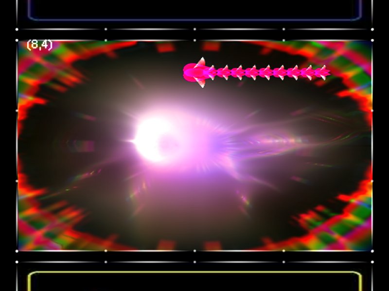
I began working on some shader model 3 effects in Neon, and also creating more variations of the procedurally generated enemies. These screenshots show various stack tests with a string of enemies overlaid.
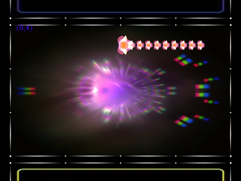
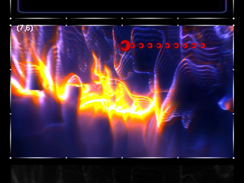
We were getting some lovely new Neon stacks with the shader model 3 work I was doing (a lot of it ended up going into the Neon backdrops for Space Invaders Extreme on the 360). However the in-game graphics were looking a bit shabby and it was clear we needed to step things up a bit there.
The first thing was some new sprites – here you can see the ship and the sheep are new and much more detailed. We also needed a way of getting the game elements to show up better over the background Neon stack and any explosion effects, so I came up with a shader which would generate an outline around things rendered onto a specific layer in the Neon stack. This was then composited into the final image. You can see the effect of this shader in this image and the following ones.
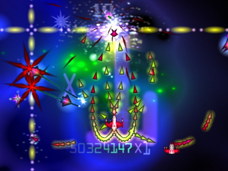
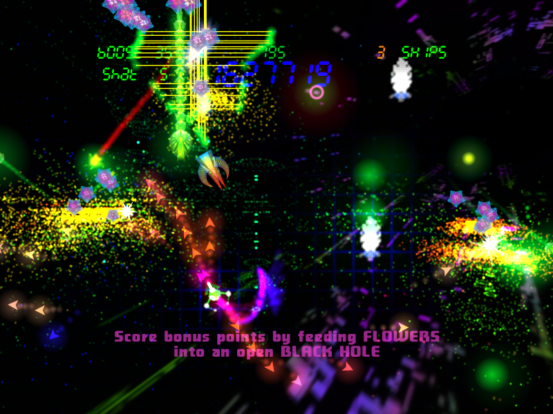
The gameplay was also changing too, becoming very much its own thing rather than a port of GR++. Here we see a nice sm3 background and loads of new gameplay elements on top of it – stepping lasers, Snowflakes, and new guns with very high bullet firing rates. You can still see some stuff remaining from the old game though, in the shape of the “10” bonus qt the top of the screen.
Perhaps the most significant addition at this time was that of gravity affecting the bullet trajectories. Although the new outlining shader works well to lift gameplay elements above the background, nonetheless people could have been forgiven for not knowing what the smeg was going on in this screenshot.
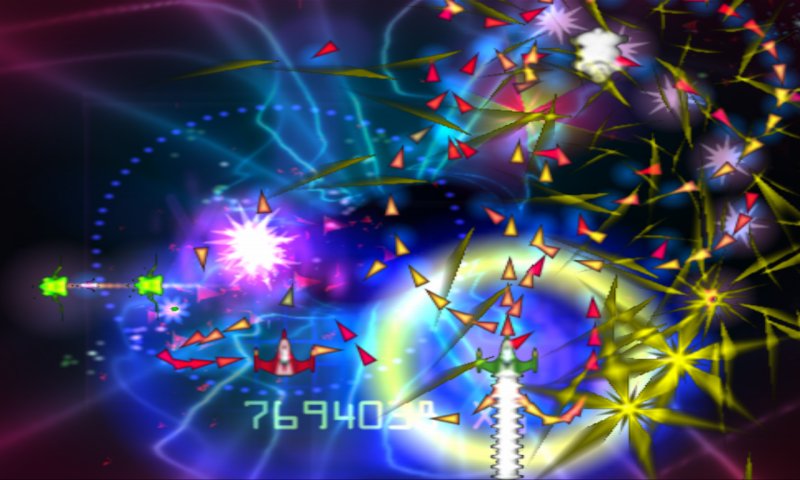
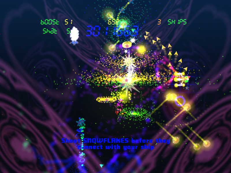
Further refining of the effects in the game made it look much less low rez – although we were still working on the 512×512 internal textures the use of smoothing shaders and the outline shader made things look reasonable at the kind of rez we’d be outputting on for the Xbox 360.
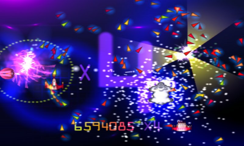
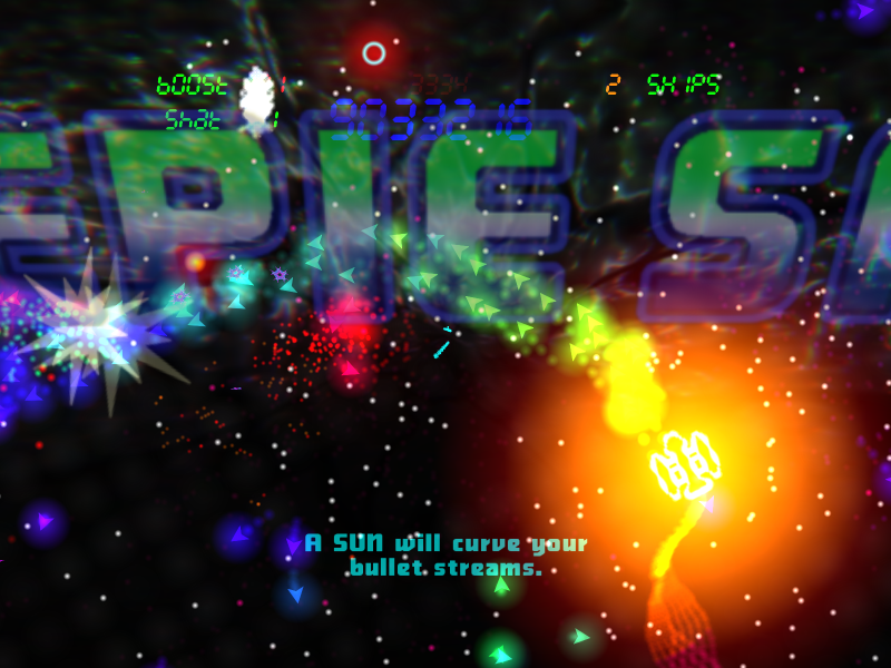
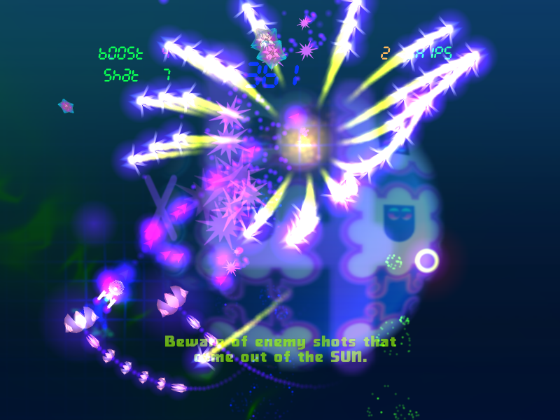
Here we can see a two-player coop mode that was implemented on the Xbox 360 version. The big red thing that looks like a radiation sign was the predecessor of the Sun.

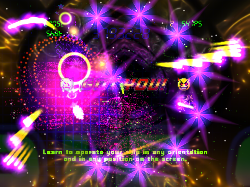
The outlining shader was quite good at picking out the game elements even over quite strong backgrounds like Flaming Cippy here.

But still some backdrops needed level balancing and were just too strong to not overwhelm the action.
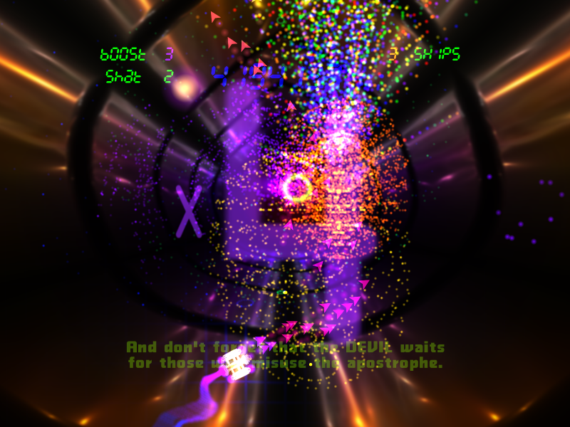
At this point we had what was shaping up to be a nice arena-style shooter for the x360 – it had twin stick controls and quite a distinctive style and although it wasn’t yet finished there were a good 30 or so playable levels and we felt it a reasonable enough alpha demo to send off to Microsfot.

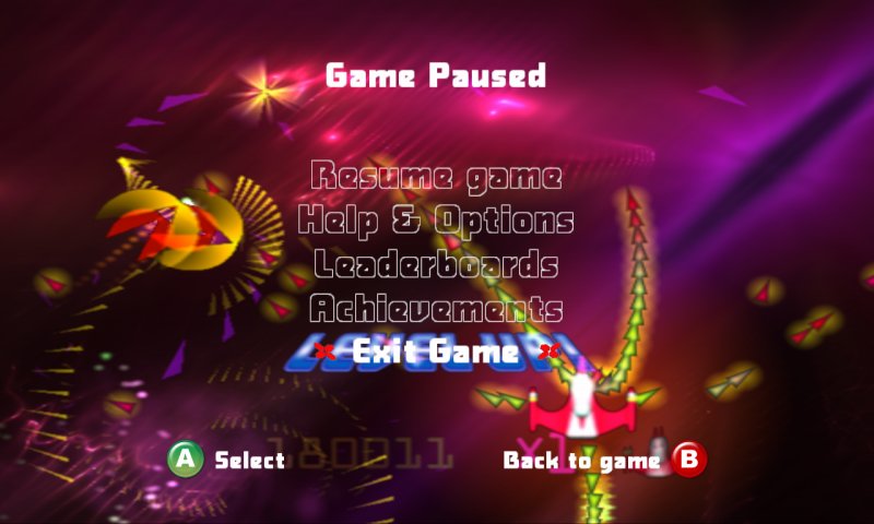
And we’ll leave this era with a couple of shots of the UI from that time. It still needed work to raise the UI out from the detail of the game when paused.
At that point the project basically went into hibernation for some months, while we awaited a satisfactory response from MS. As time went on it became clear we might well wait forever for that, so we decided to work instead on prioritising a PC version of the game.
This brought with it several problems. For one, PC users are far more likely to be playing the game in much higher resolutions than people using a console with their tellies. We wouldn’t be able to get away with running the game on the internal 512×512 Neon stacks – even with our smoothing shaders and the best will in the world, when scaled up and viewed on a PC monitor things did look a bit low rez.
So at the start of the year, in around February IIRC, I did a bit of internal restructuring to bring the game element rendering out on top of the final render target rather than having it inside the Neon engine. Since Neon effects are smoothed to smeg by their very nature it doesn’t matter of they are generated internally at 512×512 and then scaled up, but for objects with more detail it’s better to render them at the actual output rez chosen by the user.
Again this introduced problems – we had bitmap resources for some of the game elements and bitmap resources don’t generally rescale well. I wanted to make something that looked and played well at 800×600 or 2560×1600 (the native rez of my big Dell monitor). I had a not-very-much-fun time of it between February and the start of April this year where I really didn’t know where I was going to go with it or even if it would end up being any good at all.
Prioritising PC also made a change in control method imperative. You can’t expect everyone to have a gamepad, whereas everyone has a mouse; so we needed to change things back to mouse control. On x360 we’d been heading towards being pretty much a straightforward twin-stick arena shooter and the pace and balance of the gameplay had been geared towards that. The addition of gravity had been an interesting extra rather than the main focus of the game. And yet there was one mode of the Xbox 360 game called “Left-Hand Path” mode that’d always particularly pleased me.
In LHP mode you controlled the ship with just the left stick (hence the name), relying on position and gravity to aim the shot streams. I found this mode visually very pleasing to play and quite a nice change from traditional arena shooter twin stick gameplay which is very common these days.
Implementing arena shooter controls on a mouse would be awkward anyway so I decided to make a new control method, and to prioritise gravity and its use to create visually interesting bullet streams. For a while I had the game running on the joypad but with ship rotation instead of bullet aiming on the right stick (and you can still play this mode in the released game if you want to and have a joypad). This was OK on the joypad although not everyone liked it – but really came into its own when we moved over to full mouse control as God and Nature intended.
With the change in control method and input device the whole feel of the game changed, the priorities of play changed, everything changed really. All the levels were rebalanced completely.
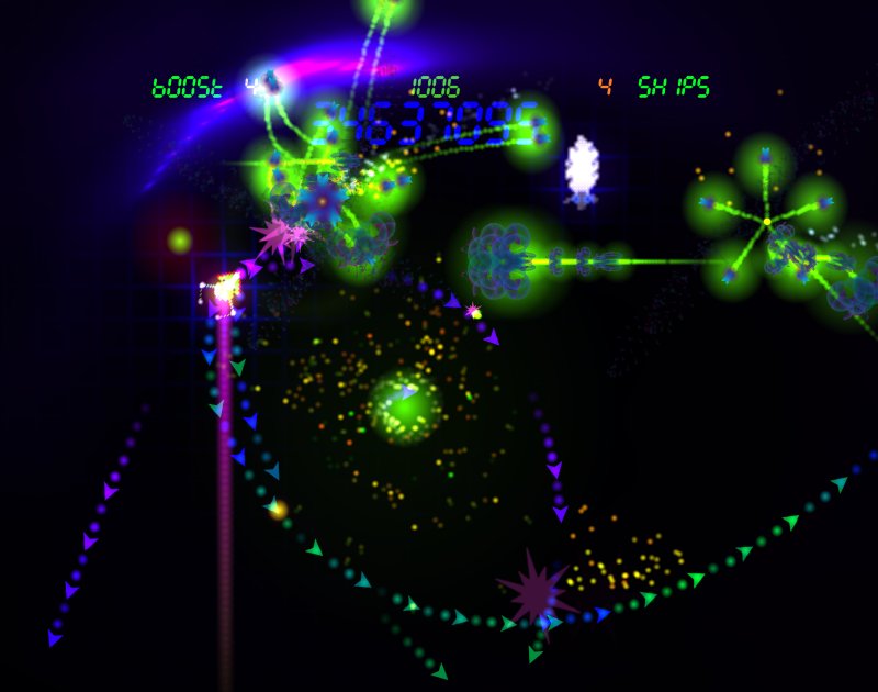
Eventually I found a way around the nonscalability of bitmap artworks that I was happy with. I still wanted to represent some game shapes as classic pixel art, but without the squareness and jagginess of actually drawing honking great square sprites. I ended up with a solution involving a glowing matrix of pointsprites that twinkle and have a dynamic throbbing wave that ripples through the shape you’re drawing. This style looks fine at even very high resolutions, making the game almost resolution independent.
Using this method of representing key game elements such as the sheep (based on the bitmap of the sheep out of Sheep In Space on the C64) and the player ship proved very effective. I was able to create some classically iconic ships that fit in with the game’s new style very well.
For the in-game score and status displays I decided to use a simulation of a 7-segment LED (it seemed appropriate after the Nixie tube display that I used for Space Giraffe).
The Neon backdrops are subdued and much more gentle so as to make the glowing graphics of the main game elements stand out vibrantly and strong.
The straight tail on the player ship was later replaced with something a bit more floaty.
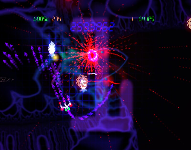
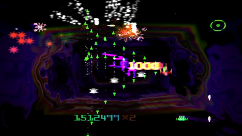
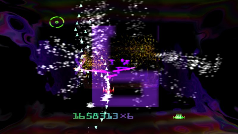
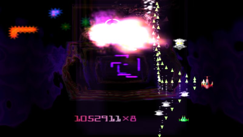
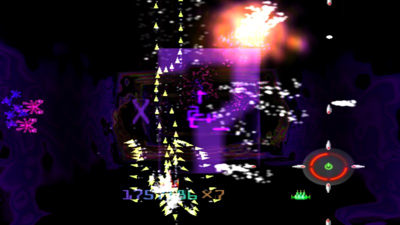
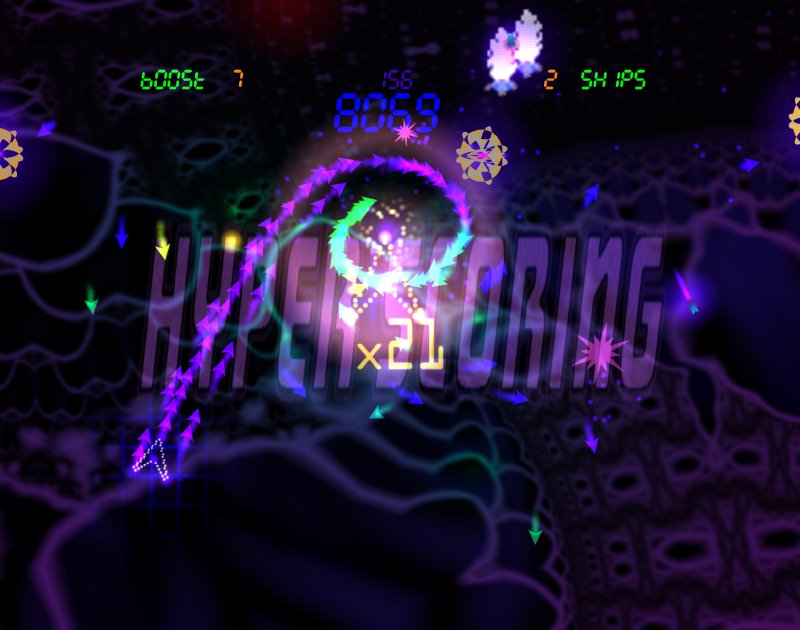
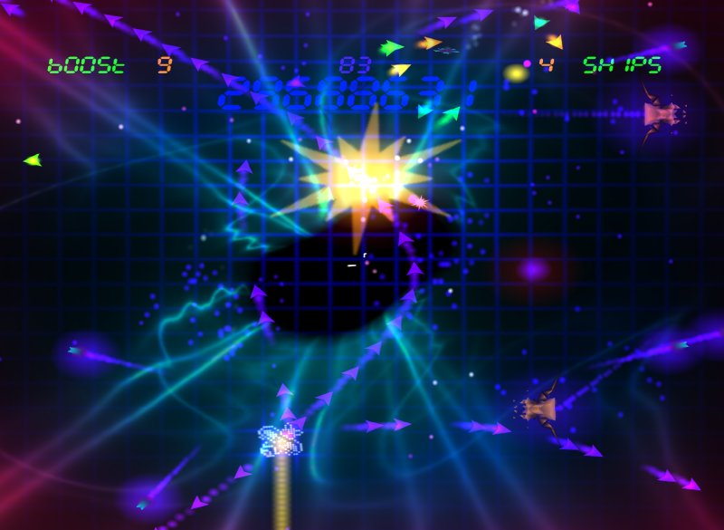
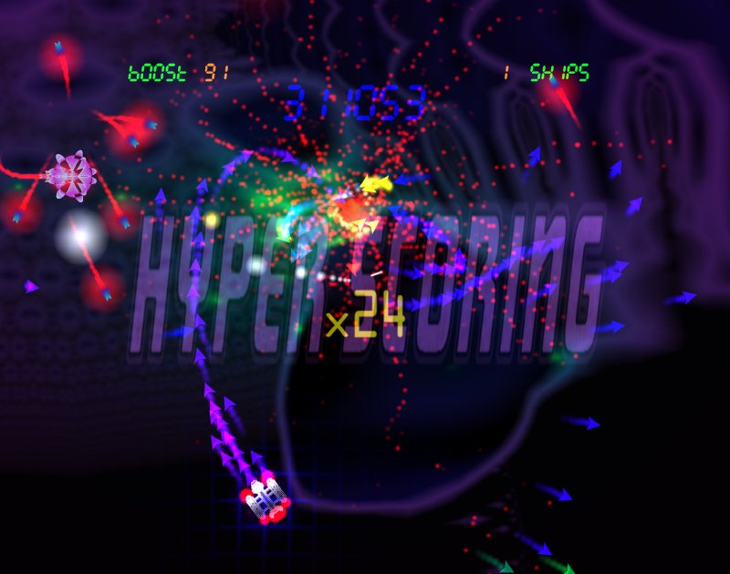
And that brings us almost up to present time, and the more recent screenshots I am sure you are already familiar with.


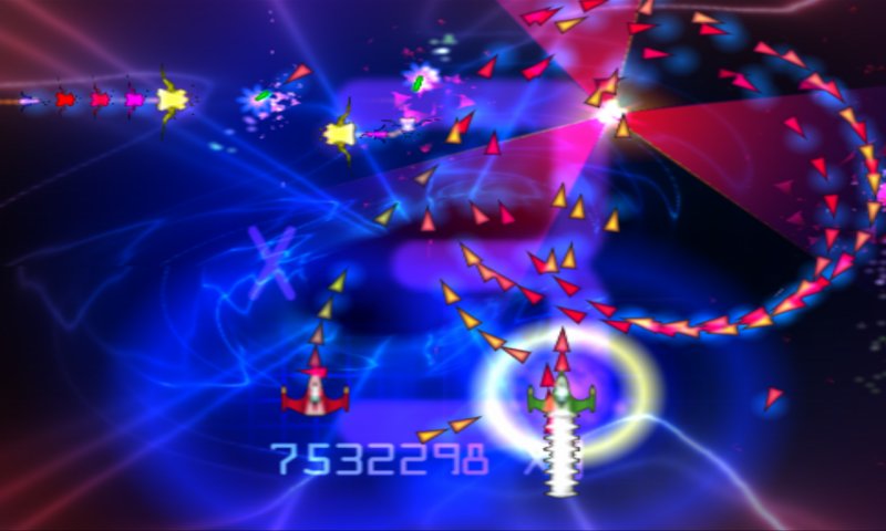
What is remarkable is that the game was almost entirely redesigned between February this year and now, and it was only around mid-April that I felt it was taking the right direction both graphically and in terms of gameplay. I think the game has come out better for its enforced retransition to the PC – the graphics are better, less resolution dependent, and have a very distinctive style; and the gameplay has evolved into something far more interesting than just another arena shooter, of which there are many these days.
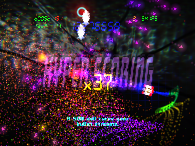
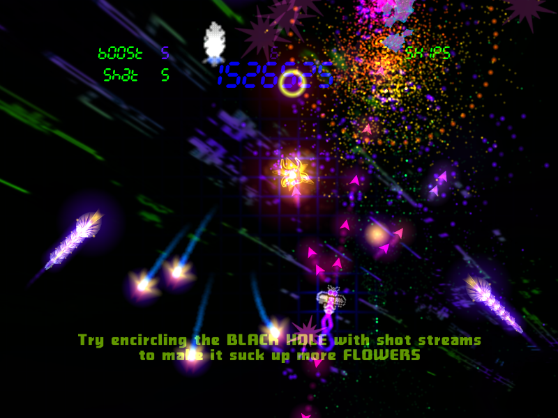
The emphasis on the use of gravity and the coupling of the shape of the bullet streams to scoring leads to an interesting dynamic in the game – one finds oneself balanced between the need to survive from an onslaught of attacks, and the desire to craft a particularly pleasing and auspicious sigil with your bullet streams and their interaction with the gravitic masses.
It’s been a long and strange journey for this game but I hope that this exposition of its development and the recent screenshots and videos will show that it’s been worth the effort. I am just glad it’s finished now and looking forward to moving on with the release sequence over the coming weeks.
Inside ...