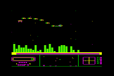
The other day I was playing through some of my Gamebase collections and spent a while checking out an old favourite of mine on the c64 and Atari 800, “Repton”.
And no, I don’t mean the BBC Boulderdash-not-quite-clone of that name, nor the posh girls’ school, but a rather nice Defender-inspired shooter.
The stylish title screen also included a neat demo mode that showed off all the game’s enemies. The game wasn’t purely a clone of Defender and had some neat touches – your ship could cloak completely and become safe from attack but you couldn’t thrust or fire in the cloaked state. You had to prevent the bad guys from stealing bits of your buildings to make a base, and nicking energy from your power plants. It had heavily inertial controls, great sound effects, and was a really nice game that most people in the UK probably never heard of. I devoted a fair bit of time to it back in the day and enjoyed revisiting it on the emulators.
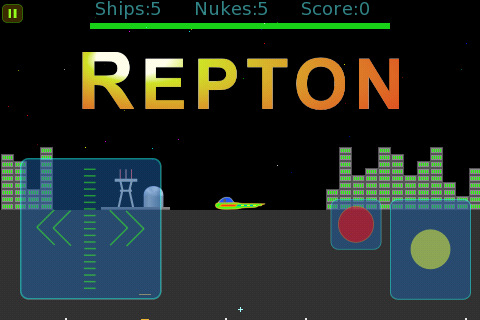
On a whim I thought I’d look in the app store to see if there was any version of it available, perhaps as an image for the c64 emulator or something. Imagine my joy when I found not just an emulation version but an actual native iOS version – and done by one of the original authors, no less! Hoo boy, I thought to myself, and figured I was in for a treat. I went to the game’s page and took a look at the screenshots:
Erm… OK. Let’s ignore for a minute the HONKING GREAT VIRTUAL CONTROLS PLASTERED OVER A LARGE AMOUNT OF THE VISIBLE SCREEN. Because that’s an easy mistake to make. (Actually no. I’m lying. It isn’t an “easy mistake to make”. It’s an egregious example of the collective idiocy that has a Scientology-like grip on vast swathes of the iOS game development community. Trust me, from outside, in the land of rationality, the idea that you have to overlay images of old-style joystick controls and buttons in specific places on a modern touchscreen is every bit as loony as evil Lord Xenu and the volcanoes and atom bombs. It’s stupid, and sane people don’t do it, and it pisses me off no end that there are people out there getting paid way more than me to churn out games with shit controls. But anyway I shan’t digress any more about the onscreen controls. Even though they get not just my goat but my entire flock).
Even *aside* from the horrid onscreen joystick though, look at the graphics. They’ve been modernised, they are higher rez… and they’ve pretty much lost the *stylishness* the original 8-bit pixel graphics did. They look like they might have come out of a Powerpoint presentation or some Flash animation. The palette’s been toned down, everything’s neater but… they just look insipid compared to the grainy-but-cool-looking original.
And whereas the scanner is actually larger and more detailed than the original, it is somehow less distinct (and not helped by the HUGE OVERLAYS plastered on top of it). It’s no longer neatly separate from the gameplay area and it’s harder to get an overview of the action than in the original game.
I guess I’d been hoping for something more along the lines of my own Minotaur Project style – keeping the basic feel of the oldschool graphics but enjoying the lack of limitations in modern hardware, allowing more effects and fluidity in the gameplay. And this is something I see in a lot of iOS games – graphics very neat and tidy and polished-looking but lacking that oldschool feel that I want when I’m playing an oldschool game.
I think it’s possible to “improve” things too much, and lose something in the process.
Which is something I hope I *haven’t* done in my upcoming game “Caverns of Minos”, which is coming along very nicely. It’s turning out to be a kind of sequel to Minotaur Rescue, and is done in a style that’s heavily based on the Atari 8-bit computer graphical style, only with a lot more stuff going on than you could ever do on a real atari 800. More on that in due course ![]() .
.


